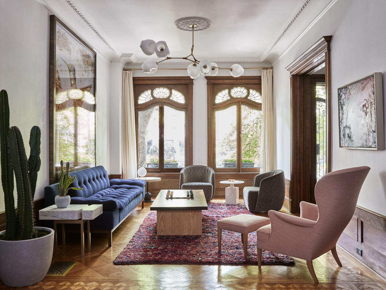
Elaborate ornamental plasterwork + modern art = gold
Renovating and decorating an old house for modern life is always a balancing act. Become too obsessed with tradition, and you're living in period rooms; go for the High Modernist look, and you might as well have bought a condo in a glass tower.
But the interiors of this 1901 limestone house in Brooklyn's Park Slope neighborhood—designed by the Portland, Oregon, studio Jessica Helgerson Interior Design—get it right.
/cdn.vox-cdn.com/uploads/chorus_asset/file/10879411/House_Calls_Park_Slope_Jessica_Helgerson_Sturman_parlor.jpg)
The house's owners, a couple with three children, "appreciate contemporary art and design," says Chelsie Lee, the senior designer on the project, "and wanted the spaces to feel modern, while respecting the historic architecture." So, the designers filled the house with furniture that is contemporary without being hard-edged, and added artwork that complements what the clients already owned.
/cdn.vox-cdn.com/uploads/chorus_asset/file/10879415/House_Calls_Park_Slope_Jessica_Helgerson_Sturman_exterior.jpg)
/cdn.vox-cdn.com/uploads/chorus_asset/file/10879527/House_Calls_Park_Slope_Jessica_Helgerson_Sturman_entry_.jpg)
Most of the house's original elements remained, and were in good condition, including butternut wood paneling, wood floors, ornamental plasterwork, doors, and windows.
The kitchen and bathrooms were original, but were extensively renovated by the designers. (Brooklyn-based CWB Architects, the project's architects of record, designed a terrace at the back of the house, as well as one off the second-floor master bedroom.)
/cdn.vox-cdn.com/uploads/chorus_asset/file/10879423/House_Calls_Park_Slope_Jessica_Helgerson_Sturman_library.jpg)
Here and there, the original architecture was modified to adapt spaces to modern family life. The clients, Lee notes, "wanted the house to be approachable and kid-friendly." The first floor of the house includes the living room, parlor, dining room and kitchen; the library, office and master bedroom occupy the second floor, while the children's rooms are on the third floor.
Throughout the house, old and new engage in a stylish dialogue: The geometric wrought-iron grille on the wood-and-glass front door is reflected in the design of the new marble floor in the entry. The shell-patterned stained glass in the house's front windows—along with a wallpaper by the artist Lindsay Cowles—inspired the kitchen's ceramic wall tiles, made by Tempest Tileworks in Portland, that are a contemporary twist on the classic Delft design.
/cdn.vox-cdn.com/uploads/chorus_asset/file/10879395/House_Calls_Park_Slope_Jessica_Helgerson_Sturman_diningroom.jpg)
/cdn.vox-cdn.com/uploads/chorus_asset/file/10879407/House_Calls_Park_Slope_Jessica_Helgerson_Sturman_kitchen.jpg)
In the dining room, the design team added its own historically respectful version of the large, built-in wood cabinets common to houses of the early 20th century, re-creating the missing leaded-glass panes for the room's bay window by looking at similar windows in the neighborhood. They departed from tradition by painting paneling in that room white, making the space brighter.
In the kitchen, an original swinging door leading to the dining room was replaced by a wider open doorway that both brings light in from the back of the house and creates a more accessible, family-friendly connection between the kitchen and the rest of the first floor.
The kitchen itself received a complete renovation: a stair to the basement, which is now accessed via the dining room, was relocated; the design team added three large windows along the outside wall and created a dining nook. The team also installed new cabinets and appliances, along with encaustic concrete floor tiles in a soft black.
/cdn.vox-cdn.com/uploads/chorus_asset/file/10879403/House_Calls_Park_Slope_Jessica_Helgerson_Sturman_kitchen_1.jpg)
The house's furnishings and its sculptural lighting fixtures come from a who's who of contemporary designers, among them Lindsey Adelman, BassamFellows, Another Country, Egg Collective, Jason Miller, Ladies & Gentlemen Studio, and Jaime Hayon.
The rich tones of the upholstery fabrics throughout harmonize with the brightly colored Moroccan rugs used in many of the rooms, along with custom pieces by Jessica Helgerson Interior Design, like the living room's tufted sofa, the parlor's curved sectional sofa and coffee table, and the tables in the dining room and library.
/cdn.vox-cdn.com/uploads/chorus_asset/file/10879425/House_Calls_Park_Slope_Jessica_Helgerson_Sturman_masterbedroom.jpg)
/cdn.vox-cdn.com/uploads/chorus_asset/file/10879455/House_Calls_Park_Slope_Jessica_Helgerson_Sturman__masterbath.jpg)
/cdn.vox-cdn.com/uploads/chorus_asset/file/10879509/House_Calls_Park_Slope_Jessica_Helgerson_Sturman_hall_.jpg)
And contemporary art—like Vik Muniz's large digital print Hummingbird (Scrap Metal) in the living room, or the monumental photograph in the library of the Cathedral of Santa Maria Assunta in Siena, Italy, by Markus Brunetti—further sharpens the conversation between contemporary and historic elements in the house.
For the master and kids' bathrooms, the designers riffed on traditional hexagonal-tile floor patterns, updating them with bold colors. The bathrooms themselves have custom built-in medicine cabinets with arched, mirrored doors, and the existing windows in the new shower enclosures have frosted panes for privacy.
/cdn.vox-cdn.com/uploads/chorus_asset/file/10879463/House_Calls_Park_Slope_Jessica_Helgerson_Sturman__childrensbedroom.jpg)
In the third-floor children's playroom, the team opened up a large existing closet and created a skylit reading nook lined with bright blue cushions.
Not all the furnishings are brand-new; the clients already owned the master bedroom's antique bed, and the twin headboards in the larger of the children's rooms were an Etsy find that the designers painted green (and for which they designed new footboards).
/cdn.vox-cdn.com/uploads/chorus_asset/file/10879431/House_Calls_Park_Slope_Jessica_Helgerson_Sturman__playroom.jpg)
As with any old house, renovation posed challenges: matching new wood to old, as when new floors were added to the office off the library or the children's new reading nook; or when the contractors had to take special care not to let the renovation damage the existing plasterwork.
The tile patterns and their colors required lots of color matching and samples, but Lee calls it "a fun challenge." In the end, as with all good design, the house's thoughtfully-realized rooms look effortless.
No comments:
Post a Comment